Vibrant Contrast: Why Emerald Plants Pop Against a Red Backdrop
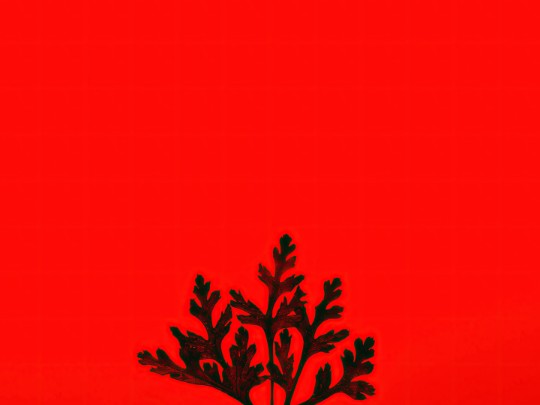
There's something undeniably captivating about the pairing of lush greenery and a bold red background. It's a visual combination that instantly grabs your attention, creating a dynamic and memorable image – a feast for the eyes, really. The deep crimson hue provides a powerful contrast to the often delicate textures and varying shades of green we find in the plant kingdom.
But it's more than just aesthetics at play. This striking contrast taps into the psychology of color. Red, universally associated with energy, passion, and strength, actually amplifies the vitality of the plants it showcases. Think about it: the vibrant hues of leaves, flowers, and stems truly *pop* against that intense backdrop, drawing your eye to the intricate details you might otherwise miss. A single, perfectly bloomed orchid against a rich scarlet canvas? The effect is undeniably dramatic, and a testament to the power of visual contrast.
This technique isn't just for artistic appreciation; it's a popular and effective strategy in product photography, particularly for botanical items. Highlighting the freshness and natural beauty of flowers, herbs, and plants becomes significantly easier when set against a bold, contrasting background. It's a simple way to elevate the perceived quality and appeal of the product.
Beyond the commercial realm, this color pairing carries a deeper symbolic weight. It can represent growth and flourishing emerging from challenging circumstances – a powerful visual metaphor for the resilience of nature. Consider the imagery of life springing forth against a fiery backdrop; it speaks to the enduring power of the natural world. Whether it's a minimalist photograph showcasing a single leaf or a complex botanical illustration, the strategic use of a red background to present plants creates a compelling narrative, a visual representation of life's enduring strength and beauty.
So, the next time you see a plant displayed against a red background, take a moment to appreciate the artistry and the underlying message. It's a combination that’s more than meets the eye – a powerful statement about the vibrancy and resilience of life itself.